5 Tips For Making Embroidery Lettering Beginners
March 10, 2022
I have always loved lettering. I was most definitely the kid who paid special attention to my handwriting in elementary school. Then I middle school my best friend and I went through a whole writing backwards phase, which was entertaining to say the least. Later, in college, I studied Graphic Design and get to learn all about typography. Now, as an embroidery pattern designer, I still love lettering. Embroidered lettering can be especially powerful with the added layer of texture thread provides. I’m going to share with you my top 5 tips for making embroidery lettering for beginners, so you all can love lettering and avoid frustration.
1 – Trace carefully
All clean and crisp lettering starts with a good transfer of the pattern. It sounds obvious, but if you want your stitching to look like the pattern, you need your tracing to look like the pattern too.
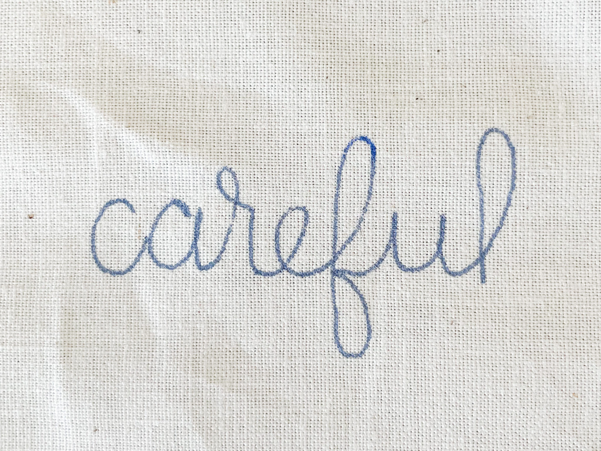
To get a good transfer, first you need to have your fabric in your hoop. Then place your hoop and fabric on top of the pattern, with the fabric touching the paper. It will look like you are tracing on the back of the hoop. Be sure you are tracing over a bright light source. It’s much harder to get good trace when you can’t see the pattern clearly. As you trace, rotate your fabric and pattern together to get the best angle for each line. If you find yourself reaching for a line or moving your hand at a weird angle, stop and adjust so your hand is comfortable.
2 – Match stitch length and thread to lettering size.
The most important part of making embroidery lettering is to match your stitch length and thread to the lettering size. If you are working on small lettering with all 6 strands of floss, your letters will look muddy. If you use a small stitch length on large letters, it is going to take FOREVER to finish with little visual benefit added. Let me put it simply for you. Large letters = large stitches and more strands of floss. Small letters = small stitches and less strands of floss
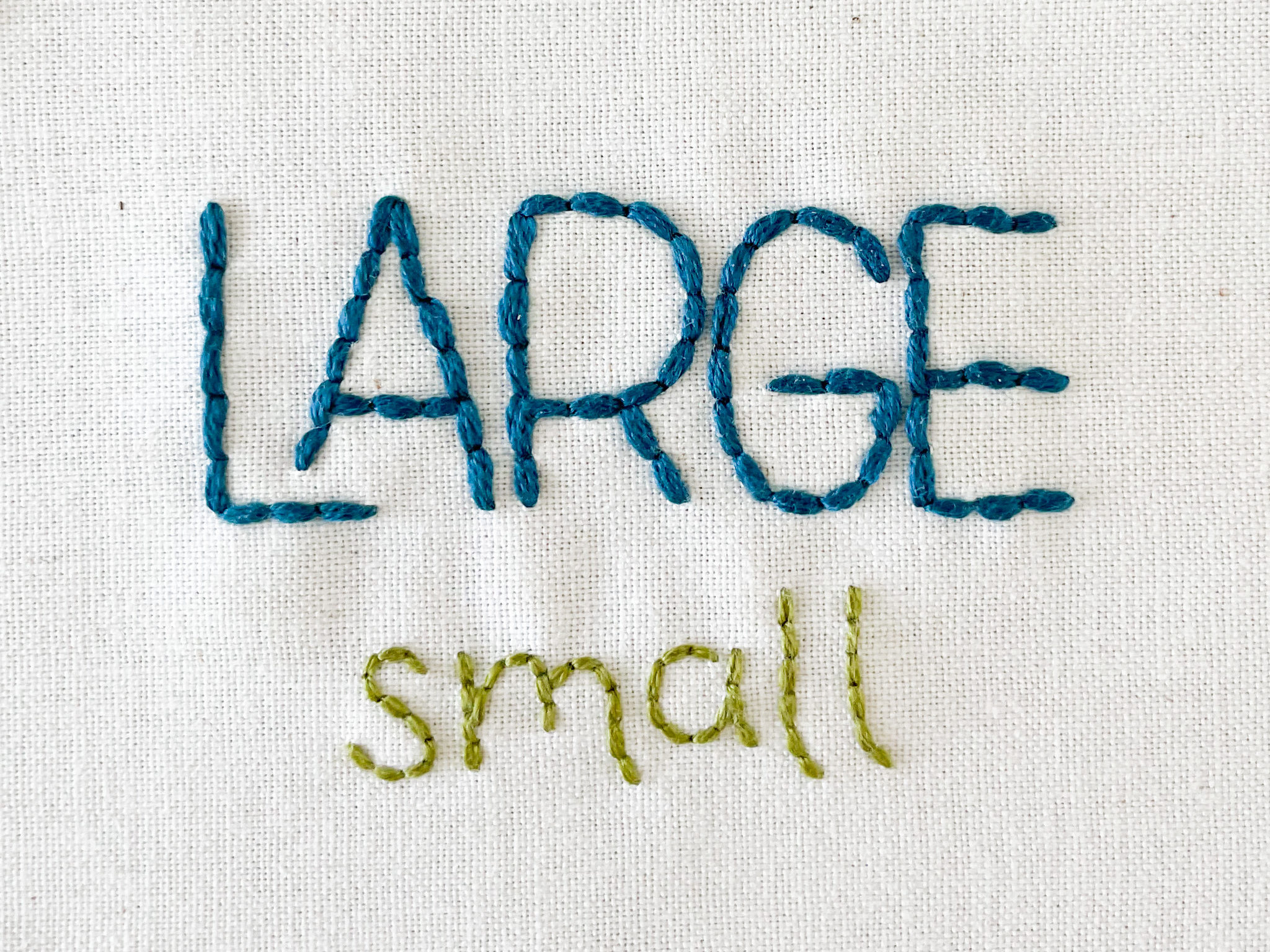
Can you see the difference between the two words? The large lettering is thicker and more substantial. The smaller lettering is thinner and more delicate. The words feel balanced against each other. This is because the thread weight and stitch length match the lettering size.
3 – Make sharp corners
A common question I get about lettering is, “how do you make the letters feel smooth?” The answer begins here, with sharp corners. If you take the time to accentuate the corners of your letters, the smooth sections will stand out in contrast.
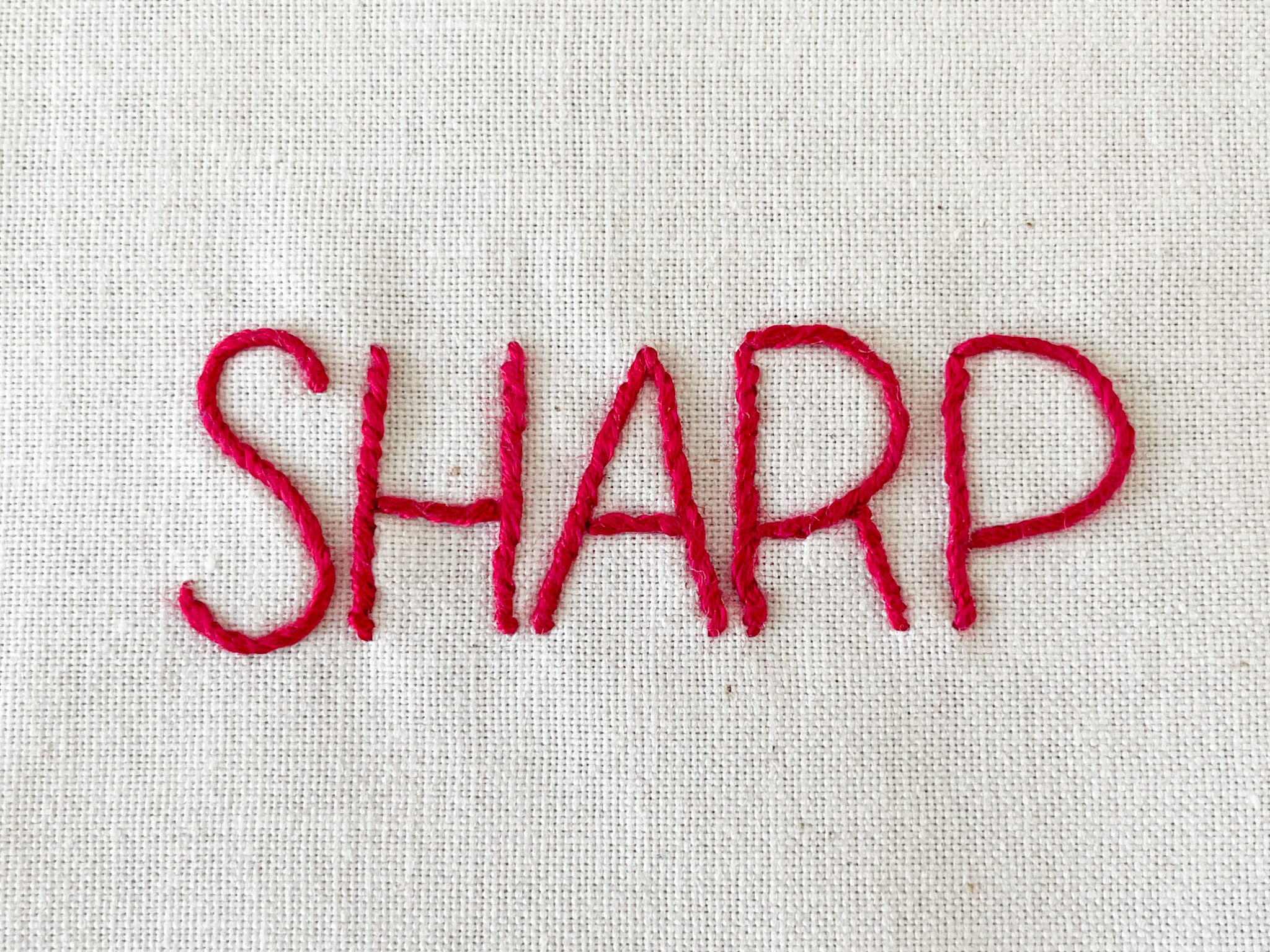
Making sharp corners is simple. All you have to do is to make sure there is a needle point on each corner. Then, if you are using a stitch like chain stitch, stem stitch or whipped backstitch (shown above) that connects multiple stitches together, you need to end your line of stitching at each corner and start a new line going out from the corner. If you try and connect your stitches through the corner, your points will be obscured by the stitch going over it.
4 – Make script lettering smooth and connected
The flip side to sharp corners, is script lettering. Script lettering, or hand lettering is a variation of old fashioned cursive. If you’re old enough to remember learning cursive in school, you’ll remember that all the letters are connected in cursive words. Making script embroidery lettering is much the same. Each letter flows into the next, making it appear as though it is one unbroken line of stitching.
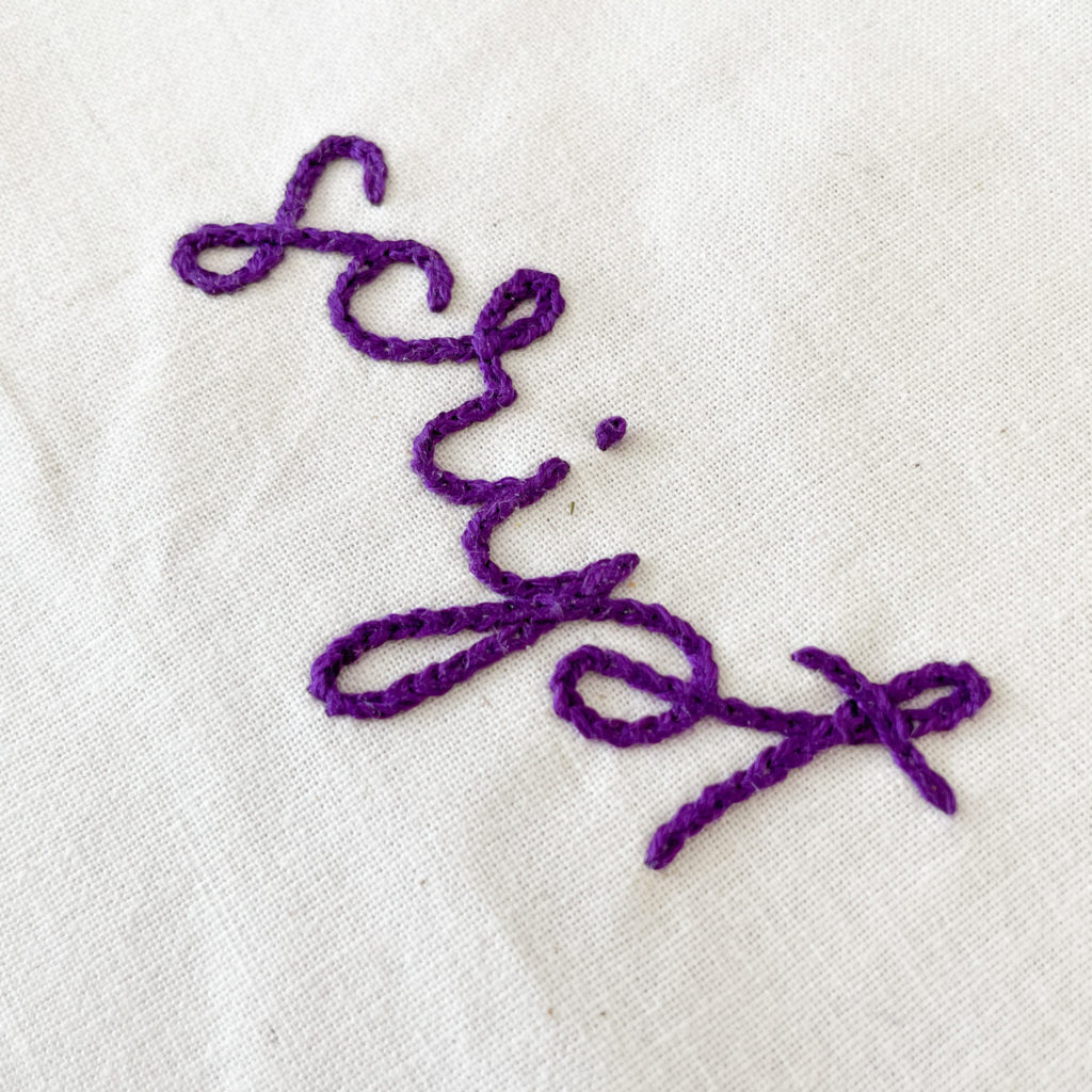
To make smooth and connected lettering, start stitching at the tip of the first letter. Follow the line being sure to make SMALL stitches along curves. This is key, it you make your stitches to large the curves will appear choppy instead of smooth. The tighter the curve and smaller the stitches you need to use. Anytime you come to two lines that cross, allow your lines of stitching to over lap. You can see the over lap in the “s, r, p & t” above.
5 – Take your time
Remember, there is no stitching contest to see who can finish all their lettering first. Take a breath a slow down. Give your self permission to make just as many stitches as you need to make clear, smooth letters. All the extra time you spend getting your lettering right will make it shine all the brighter when you finish.
Looking for a pattern with lettering?
Here are a few of my favorite patterns with lettering:
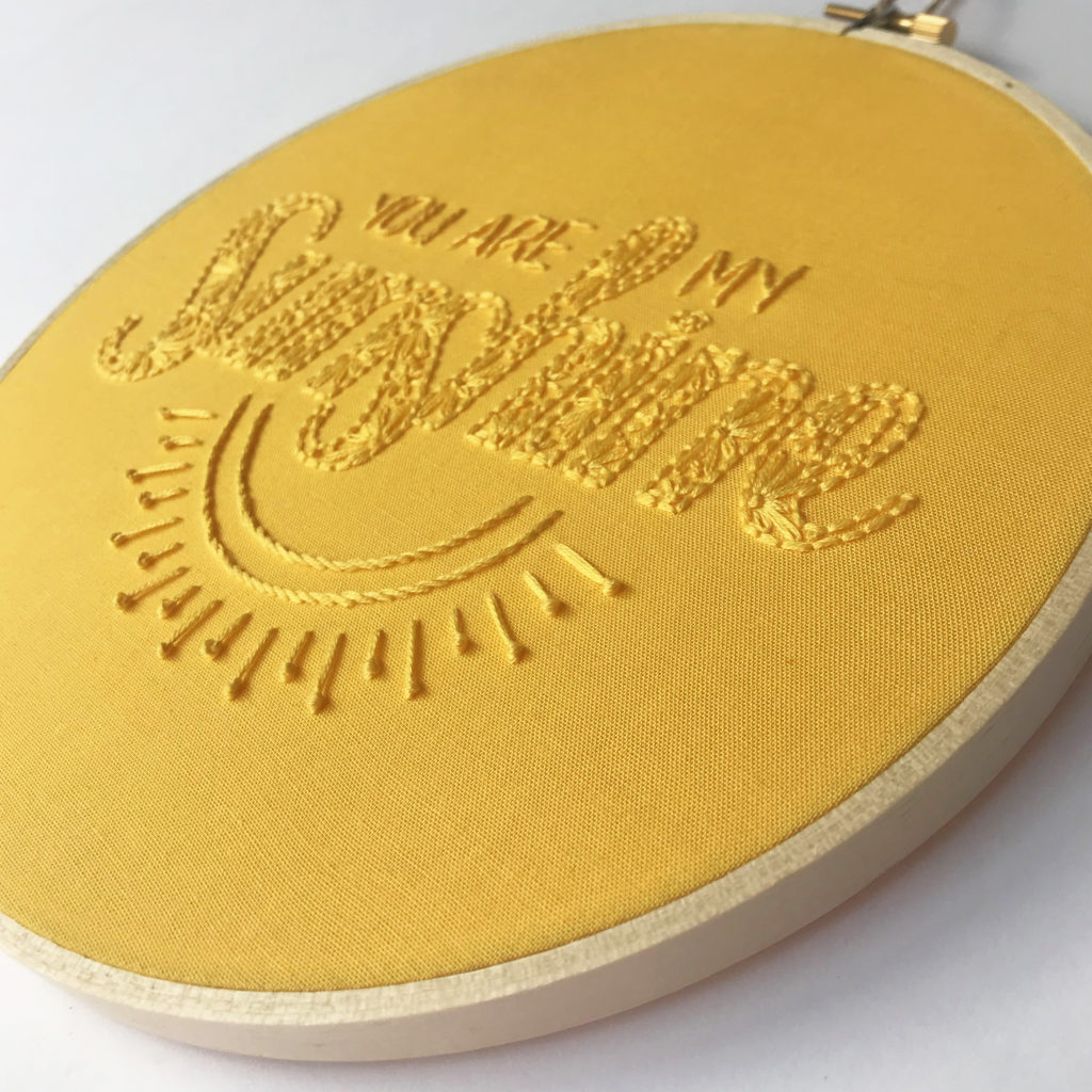
You Are My Sunshine : inspired by one of my favorite songs to sing to my kids. You Are My Sunshine, is a great patterns for monochromatic applications and full color.
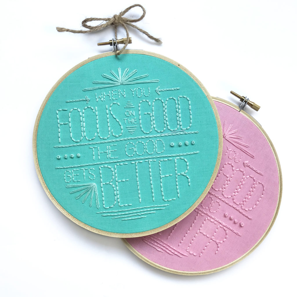
Focus On The Good : Designed as the perfect reminder to both kids and adults to remember to look for the good each day. Made with basic stitches in a monochromatic pallet.
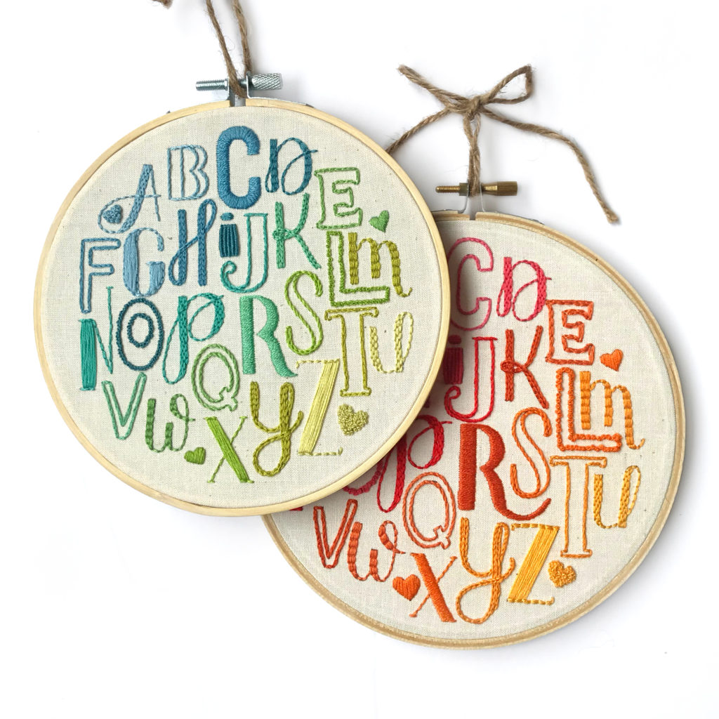
Alphabet Love : This is my first lettering hoop. I originally designed this hoop to be a full 10″ hoop, then downsized it to be 6 or 8″. Pattern come with instructions for both color pallets as well as substitutions for the most difficult stitches.
Is this your handwriting on the word “script”. or is it a font I could find??
Yes, that is my handwriting. However, here are a couple script fonts that I like to use.
August Script
Hello Honey
Nella Sue Demo
Ashley
This is a great article, thank you! I’m about to start my first project with a lot of lettering, so this is especially helpful.
I’ll be using your font recommendation hello honey for part, and need to find a good complimentary type font to go with it ☺️
Love your info! I’m new to hand embroidering letters. Where can we buy templates for the fonts you recommended?
The best free resource for fonts is dafont.com. They have a large selection and a decent search ability to allow you to filter for what you want like script or handwritten fonts.